
INTRO
Air Trail is an electronic flight logging system that replaces traditional paper journey logs for Canadian and U.S. specialty aviation operators. The problem: The previous system was confusing, forced excessive horizontal scrolling, and relied heavily on manual workarounds that increased cognitive load during flights.
My work focused on separating aircraft serviceability from daily flight logs, introducing intuitive visual cues, and building a flexible, asynchronous workflow. The goal was to ensure strict regulatory compliance while drastically reducing the friction pilots experienced during data entry.
STATUS
Shipped
TYPE
Tablet Application
B2B SaaS
Aviation Tech
TOOLS
Figma
Notion
Problem
The app’s rigid data entry conflicted with the unpredictable reality of pilot operations, causing users to get blocked by compliance hard-stops. A lack of visual feedback left pilots unsure if their logs were successfully signed off.
Solution
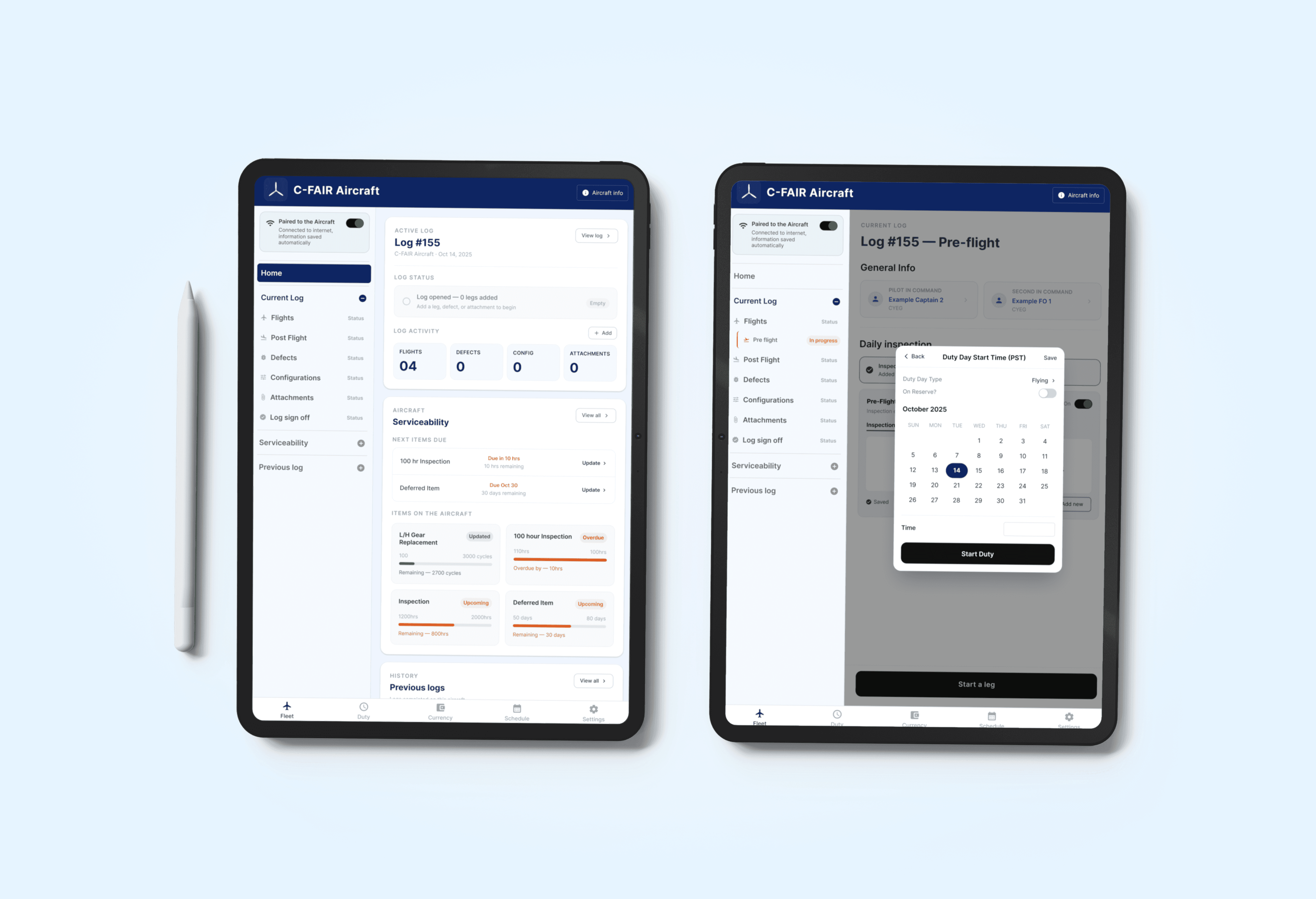
I designed an asynchronous, guided workflow utilizing a persistent side navigation bar. I introduced clear color-coded statuses and separated complex aircraft maintenance data into a distinct, highly visual card view.
Impact
Reduced cognitive load by prioritizing minimal navigation and eliminating redundant menus. The digital interface now aligns with the actual mental models of pilots, resolving the primary friction points causing support tickets.
Final screens



Process
Because aviation software requires deep industry expertise, I couldn't rely on standard UI assumptions.
Heuristic Evaluation & Empathy
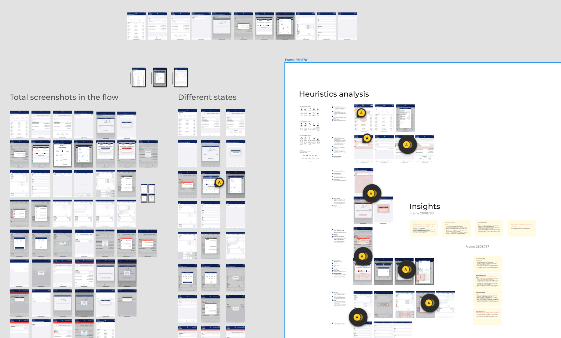
I conducted a heuristic audit of the interface and researched traditional paper logbooks, analyzing how pilots transition to digital tools under tight time constraints.
User Interviews & Mental Models
I interviewed pilots to understand their operational constraints, test design hypotheses, and evaluate their visual preferences.
Support Team Insights
I collaborated with the customer support team to review recurring user queries, uncovering where pilots and mechanics regularly hit roadblocks due to app unintuitiveness.
Wire framing & Iteration
Recognizing that different operators require custom workflows (such as U.S. operators who skip pre-flight planning), I explored multiple IA versions, drew inspiration from industry tools like ForeFlight, and mapped out flexible wireframes before building out the final prototype.


THE FRICTION
The app's interface struggled to communicate its state, placing a heavy memory burden on users during critical workflows.

System Feedback
& Status Visibility
The heuristic evaluation revealed that the app lacked crucial visual feedback for key actions, such as the ATS Pair button and inspection sign-offs.

The structural layouts forced excessive horizontal scrolling and relied on inconsistent terminology, utilizing phrases like "Field sign off," "Sign off," and "Pre-Flight signature Prompt" interchangeably.

Cognitive Load
& Guidance
The system created unnecessary friction and memory burdens by lacking directional cues and inline guidance after a user completed a field.
Design upgrades
DESIGN UPGRADES - SEPARATING SERVICEABILITY
Pilots shouldn't have to dig through maintenance data just to log a daily flight.
During my research, it became clear that the serviceability summary and the daily journey log are completely different mental spaces. The old UI squished "next due" maintenance items into scrollable logs that required excessive horizontal scrolling, resulting in a poor user experience.
I pulled maintenance dues and deferrals out of the flight log entirely, redesigning them into a separate, highly visual card view. I introduced color-coded countdowns for next-due maintenance items, giving pilots instant airworthiness context without cluttering their daily logging tasks. I also adapted the design for U.S. operators who skip planning entirely and require a simplified "logging only" interface.


DESIGN UPGRADES - ASYNCHRONOUS WORKFLOW
A digital logbook shouldn't force a linear path when real flights are unpredictable.
A major support trigger was pilots getting blocked because they tried to input information out of order. The system also enforced dynamic regulatory rest requirements, but utilizing hard-stops created major data discrepancies when pilots bypassed the iPad entirely to start their duty.
I replaced the confusing nested menus with a persistent side navigation bar that visually guides the user through the phases while allowing them to jump back and forth as needed. Pilots often prepare manifest details the night before and only log takeoff and landing times after the flight. The new architecture supports this reality, allowing pilots to save drafts and input data asynchronously.

DESIGN UPGRADES - ACTIONABLE VISUAL CUES
If an action is critical for compliance, the system's feedback must be unmistakable.
The previous interface struggled to communicate state. Critical actions like defect sign-offs lacked visual confirmation, and users couldn't tell at a glance if an item was successfully cleared by a mechanic or deferred by a pilot.
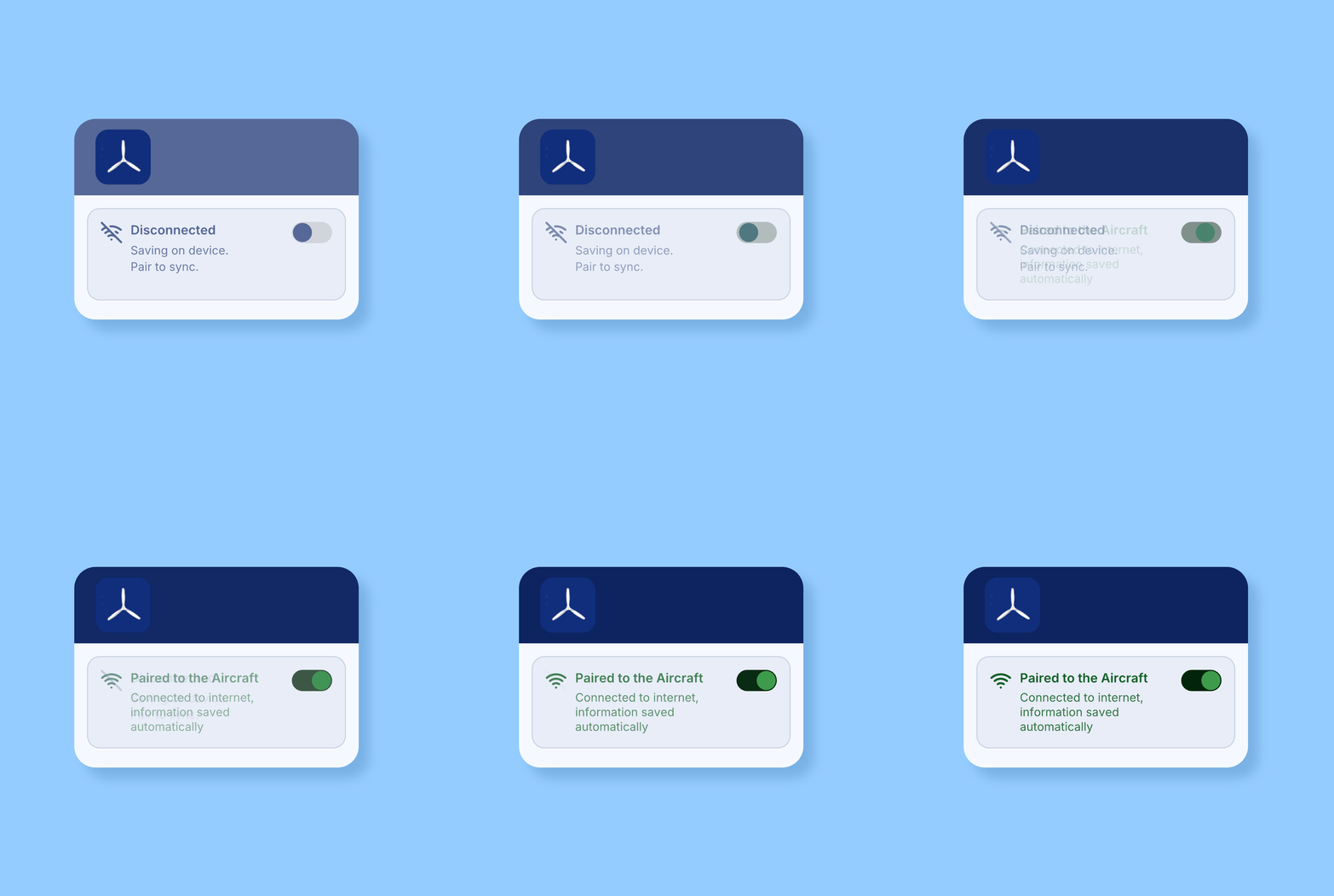
Based on pilot feedback, I implemented a universal color-coding system: green for good to go, yellow for caution, and red for hard stops. I also introduced a prominent, globally visible toggle that explicitly states whether the device is paired to the aircraft and syncing data. This completely removed the guesswork from compliance tracking

Results
MEASURING SUCCESS
Designing for enterprise tablets means prioritizing minimal navigation.
This project was a masterclass in integrating standard UX design processes with highly specialized industry expertise. If I were to track the live success of this redesign, my primary metrics would focus on operational efficiency:
Did we eliminate workflow blocks? I would monitor support ticket volume specifically related to pilots being blocked by data-entry order or location logic errors.
Is logging faster? I would measure the time spent on the final logging tabs post-flight to see if the new side navigation reduces the friction of logging final flight hours.
The ultimate question I want answered: Do pilots stop treating the app as a frustrating compliance hurdle and start using it as an intuitive flight assistant?

LEARNINGS
Digitize the mental model, not just the paper form.
When translating a complex physical process into a digital tablet interface, you cannot just digitize the paper form. By focusing on contextual clarity, distinct visual cues, and workflow synchronization, we transformed a frustrating compliance tool into an intuitive pilot assistant.
