
INTRO
Pratilipi is a massive user-generated literature platform for India's "next billion internet users." The problem: as a multi-language app, varying character lengths were breaking the UI, and a bloated architecture was burying core features.
The timeline was aggressive: 1 week. I needed to redesign the homepage to handle existing content gracefully while building an elegant foundation for future growth experiments. My work focused on fixing the multi-language UI breaks, introducing a modular carousel system, and restructuring the navigation to make the platform easier to explore and monetize.
STATUS
Capstone project
TYPE
Mobile Redesign
B2C / UGC
Publishing
TOOLS
Figma
Notion
Problem
Static layouts clipped multi-language text, while a bloated architecture and endless vertical scrolling buried core monetization tools, creating high friction that made content discovery frustrating.
Solution
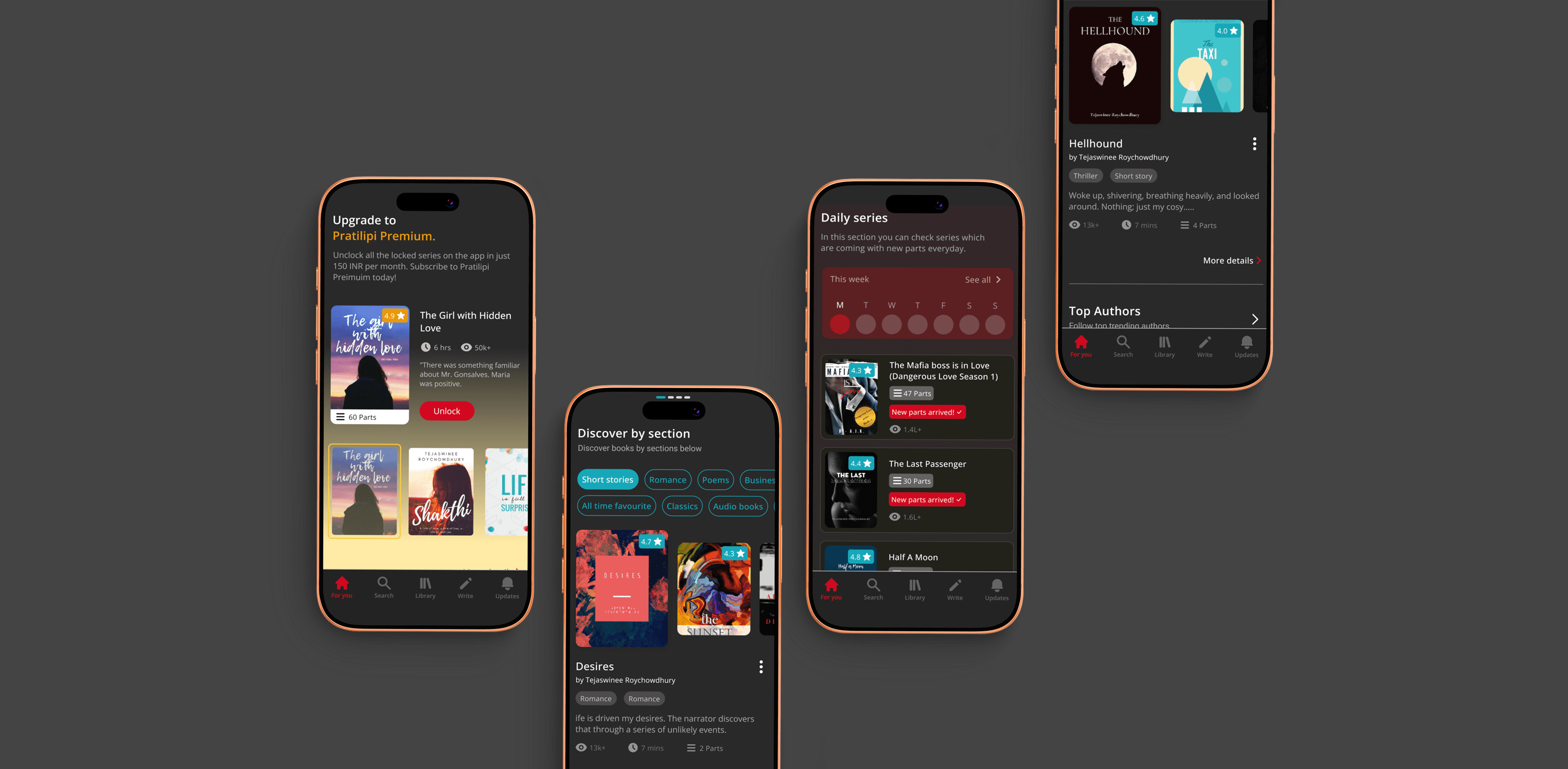
I designed an adaptive, modular carousel system to handle variable character lengths and completely restructured the navigation to reduce scroll fatigue, bringing high-value features to the forefront.
Impact
The UI now scales seamlessly across all languages, while the new architecture slashed manual scroll length and increased visibility for monetization features, providing a robust sandbox for future growth experiments.
Final screens




Process
THE PROCESS
I needed to know why users were frustrated before I pushed a single pixel in Figma.
Before jumping into Figma, I ran a highly targeted, convergent-divergent sprint to ground the redesign in actual user friction.

Building empathy through user research and reviews
Aggregated app store reviews and conducted 5 in-depth interviews, revealing severe cognitive load and a complete disconnect regarding Premium value.
Created early stage wireframes
Moved rapidly from rough notebook sketches to mid-fidelity wireframes to validate data hierarchy before applying visual design.
Looked at different competitors in the market
Audited Kindle, Wattpad, and Apple Books to benchmark established UI paradigms for heavy reading apps.

Working on new information arhitechture
Stripped back and simplified the bloated flows, optimizing the structure to boost Click-Through Rates (CTR) deliberately.

Design upgrades
DESIGN UPGRADE - ADAPTIVE MODULAR CAROUSALS
Standard grids couldn't survive unpredictable string lengths, so I built a system that flexes.
Switching from short-text languages to longer scripts caused story titles to clip entirely, which instantly broke user trust.
“The layout shouldn’t break just because the language changes.”
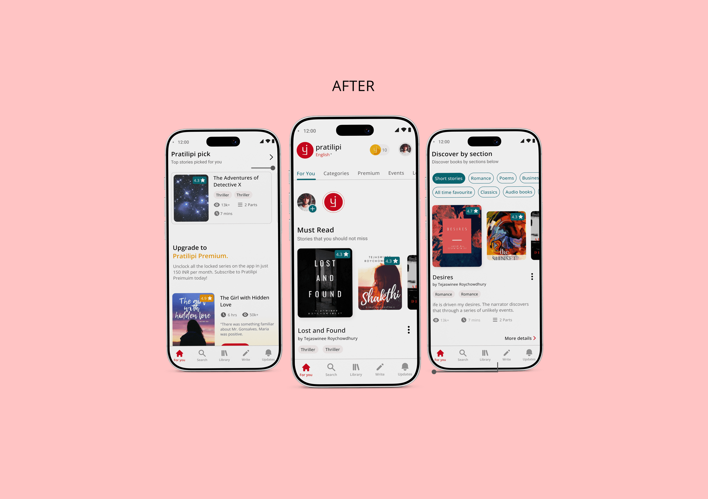
Instead of using static grids, I introduced an adaptive, modular carousel system with dynamic real estate for subtext. The layout remains visually distinct across sections, but the underlying structure flexes to fit the content. No more clipped text. No more broken UI.

DESIGN UPGRADE - NAVIGATION RESTRUCTURE
If it takes three taps to find a core feature, you've already lost the user.
Core monetization and community features were hidden behind generic "view more" menus, and search was entirely out of thumb's reach.
I moved "Search" to the bottom tab bar for immediate access and replaced outlined icons with faster-to-recognize solid variants. To fix the deep menus, I introduced a scrollable horizontal top navigation.
This increased discoverability and gave the growth team a scalable sandbox for new features without adding visual clutter.


DESIGN UPGRADE - ELEVATING PREMIUM SUBSCRIPTION
Premium was suffering from an "out of sight, out of mind" problem.
Previous premium thumbnails only showed views and genres. Users had to click into each story just to figure out what it was about causing massive drop-offs in the funnel.
The value proposition needed to be immediate. I designed a dedicated, selection-based carousel that exposes the book name, description, and ratings directly on the cards. By adding a prominent, inline "Unlock" CTA, users can confidently decide on a subscription before ever needing to click into a story.


DESIGN UPGRADE - GAMIFICATION & THE READING STREAK
The old reading streak felt like a penalty for casual readers.
The original streak was wedged into the UI, taking up valuable screen real estate while essentially punishing users who didn't open the app every single day.
I removed the static streak tab entirely from the main layout, solving massive UI clutter issues. Organic retention replaced forced participation. I introduced a dynamic push-notification that pleasantly surprises users with a 5-coin reward strictly when a 7-day streak is naturally hit.

DESIGN UPGRADE - THE UNIFIED DISCOVER SECTION
The sheer volume of content created an endless scroll, so I consolidated exploration into a unified hub.
Dozens of overlapping categories stacked on top of each other effectively buried key sections like "Top Authors" at the very bottom of the page.
I condensed these overlapping genres into a single Discover hub, utilizing customizable selection tabs based on CTR performance. I optimized card layouts to emphasize cover art and drastically reduced manual scroll fatigue, letting users navigate contextually instead of endlessly swiping down.

Results
MEASURING SUCCESS
Prototype testing is fine, but I want to know if we actually changed user behaviour.
LEARNINGS
A broken interface is often just a symptom of a rigid architecture.
The biggest improvement wasn't updating the aesthetics; it was changing the structural model.
Form must follow foundational architecture: When I stopped forcing multi-length languages into a rigid layout and built an adaptive system instead, the major UX problems solved themselves.
Design for the messy reality: Before polishing the surface, ensure the foundational system can actually survive the unpredictability of user-generated content.
